vrijdag 8 februari 2013

Kenmerken Magisch Realisme en Abstract Expressionisme

Kenmerken Magisch Realisme:

Kunstenaars als Carel Willink, Dik Ket, Pyke Koch en Raoul Hynckes laten de sfeer van deze tijd duidelijk naar voren komen in hun werk. De kunstenaars maken een bijna fotografische weergave van taferelen die een geheimzinnig aandoende sfeer oproepen. Die bijna magische sfeer wordt versterkt door het gebruik van vreemd perspectief, een spel van licht en kleur en de technisch perfecte afwerking. Het onderwerp verwijst vaak naar dood, dreiging en verval. De werken doen heel realistisch aan, maar zijn pure fantasie.


Kenmerken Abstract expressionisme:
Voor de abstract expressionisten is de handeling van het schilderen zelf belangrijker dan datgene dat zij schilderen. Het gaat niet om het weergeven van een verhaal, de tekening, compositie en vorm, maar de gebeurtenis van het creëren zelf. Harold Rosenberg zegt hierover dat de kunstenaars “het doek zien als een arena die vroeg om een handelend optreden…het beeld zou het resultaat zijn van een ontmoeting” tussen het ene materiaal (het doek) en het andere materiaal (kwast met verf).


donderdag 31 januari 2013

Architectuur Opdracht.

Met wie werk je samen? Daisy en Megan.

De opdrachtgever schrijft alle wensen voor een nieuw gebouw of voorwerp op.Beschrijf de opdracht in je eigen woorden. Denk aan: functie, doelgroep en budget.

Functie: Hotel. Doelgroep: Mensen die op vakantie zijn. Budget: 5 miljoen.

Op basis daarvan gaat de ander een voorstel doen dat voldoet aan de vraag van de opdrachtgever. Denk aan dewensen en stem vorm, materiaal en kleur daarop af. Zorg er wel voor dat de opdrachtgever blij verrast is door jouwvoorstel, dus kom niet met een heel saai voorwerp of gebouw op de proppen.Maak een schets en schrijf eventueel uitleg erbij.

Ons hotel is bedoeld voor gezinnen die op vakantie gaan en bruin willen worden. Het glas is gemaakt van zonnebank materiaal. Het hotel is heel chique en glamourous. Het hotel is erg ruim en de kamer zijn schoon, alle kamers hebben een douche, bad en toilet. Men kan ook gebruik maken van het zwembad op het dakterras. De kleur van het hotel is grijs-zwart. Dat zijn de kleuren van het luxe hotelleven.

De opdrachtgever geeft aan wat goed is en wat minder goed is.

Goed is dat de opdrachtgever tevreden is met de schets omdat het precies is wat hij in zijn hoofd had. Minder goed is dat de materialen erg duur zijn en goedkoper moeten. Omdat anders het anders boven zijn budget gaat.

Als je het er mee eens bent dat er nog iets veranderd zou kunnen worden, maak je een aanpassing aan je voorstelwaardoor de opdrachtgever wel tevreden is. Mijn aanpassing wordt:

Zilveren materialen inruilen voor staal.

Onze Schets:


maandag 14 januari 2013

Modernisme en Postmodernisme.

Hier is de opdracht die we moesten maken voor ckv.

1. De verschillen van de huizen zijn dat het eerste huis veel meer ramen heeft dan het andere huis. Ook ziet het tweede huis er wat ouder uit. (Ik vind het een beetje op een kerk lijken.) Het eerste huis komt voor mij wat vrolijker over dan het tweede huis, doordat de kleur van het tweede huis niet zo vrolijk is en een beetje grauw. Ik denk wel dat je in het tweede huis net iets meer spullen neer kunt zetten.
Ik denk dat het eerste huis bij het postmodernisme hoort en het tweede bij het modernisme.

2. Ik zou toch het liefst in het tweede huis willen wonen, omdat het minder ramen heeft. Privacy is best belangrijk. De kleur zou je altijd zelf nog kunnen verven. En omdat het eerste huis in het bos staat komen er veel insecten op af, en daar zou ik niet mee kunnen leven. (Ik vind het eerste huis wel mooier dan het tweede.)

3. Ik dacht dat het tweede huis bij het modernisme hoorde omdat we in de uitleg kregen ''Less is more.'' En omdat het niet zo'n heel mooi huis is, maar dat er verder niet veel problemen mee zijn, en er niet zo heel veel ruimte voor spullen is.
En het eerste huis kan bij het postmodernisme horen doordat er overal ramen zijn en het er best mooi uitziet. Maar dat je er toch niet zo blij mee kan zijn als je het koopt.

6 Huizen:

Ik denk dat dit gebouw tot het postmodernisme behoord, omdat het er heel apart uitziet, en het modernisme vaak alleen sober en saai was. En dat is deze niet.

Ik denk dat dit huis tot het postmodernisme behoord, omdat er verschillende vormen inzitten, maar het kan ook modernisme zijn, omdat het niet heel speciaal is.

Ik denk dat dit tot het modernisme behoord, omdat het allemaal gelijk is, en ook eigenlijk een beetje saai.

 Modernisme, omdat het er ook een beetje saai uitziet.

Modernisme, sober en volgens stricte regels.

Moderisme, sober (wel mooi) en alles is gelijk.

donderdag 6 december 2012

2 Artists

The next assignment is to choose 2 artists (from my previous blog entry). And tell something about them and give my opnion about their art.

Zaha Hadid:
Zaha Hadid was born on October 31, 1950, in Baghdad. She grew up in one of Baghdad's first Bauhaus-inspired building during an era in which "modernism connoted glamor and progressive thinking" in the Middle East. She received a degree in mathematics from the American University of Beirut before moving to study at the Architectural Association School of Architecture in London, where she met Rem Koolhaas, Elia Zenghelis, and Bernard Tschumi. She worked for her former professors, Koolhaas and Zenghelis, at the Office for Metropolitan Architecture, in Rotterdam, the Netherlands; she became a partner in 1977. Through her association with Koolhaas, she met Peter Rice, the engineer who gave her support and encouragement early on at a time when her work seemed difficult. In 1980 she established her own London-based practice. During the 1980s she also taught at the Architectural Association.
Her breakthrough was in 1983, when she struggled for the design of the Peak Leisure Club (in Hong-Kong) and won with a series of paintings. She made a show of buildings on a mountainside that were not organized according to the laws of gravity, but seemed to have found their place by an earthquake. The buildings were crooked and went through eachother. The paintings showed a world in which reality can not be realized and they characterized a transition in modern architecture.
I really like her buildings, because it took me a while to see how the building realy looked like, since it's made so complex. You can see they really thought about the design to make stunning buildings. I also like the idea of ''a world in which realitly can not be realized''. Because that's what makes the buildings special, and you don't often see buildings like these. I was really impressed by her work because of this.

                                           Design of the Peek Leisure Club by Zaha Hadid.

Jeff Koons:
Koons was born in York, Pennsylvania. His father Henry Koons was a furniture dealer and interior decorator; his mother Gloria, a housewife and seamstress. As a child he went door to door after school selling gift-wrapping paper and candy to earn pocket-money. As a teenager he revered Salvador Dalí, to the extent that he visited him at the St. Regis Hotel in New York City. Koons studied painting at the School of the Art Institute of Chicago and the Maryland Institute College of Art. While a visiting student at the Art Institute, Koons met the artist Ed Paschke, who became a major influence and for whom he worked as a studio assistant in the late 1970s. After college, he moved to New York in 1977 and worked at the membership desk of the Museum of Modern Art while establishing himself as an artist. During this time, he dyed his hair red and would often cultivate a pencil mustache, after Dalí. In 1980, he got licensed to sell mutual funds and stocks and began working as a Wall Street commodities broker at First Investors Corporation. After a summer with his parents in Sarasota, Florida (Koons took on a brief job there as a political canvasser), he returned to New York and found a new career as a commodities broker, first at Clayton Brokerage Company and then at Smith Barney.
Jeff Koons started to work withing series, in which the first was called The Pre-New, The New, and Equilibrium series. He then moved on to the Statuary series, Luxury and Degradation series, Made in Heaven series, Banality series, Puppy, and the Celebration series.
I really like his art as well, because it immediately catched my eye. Especially the Celebration series. They're very colourful and you don't see art like the Celebration series often. That's why I like it as well. I also like ''Puppy.'' Since I love dogs and has a lot of colours too. And I never saw art of a dog that huge before.

                                         Balloon dog and tulips from the Celebrations series.

dinsdag 4 december 2012

11 Artists

Pictures with the names of 11 artists:

Anish Kapoor:


Ai Weiwei:

Zaha Hadid:

Jenny Holzer:

Oliviero Toscani:

Jeff Koons:

Guerrilla girls:

Bansky:


Rem Koolhaas:

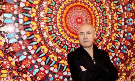
Damien Hirst:

Quentin Tarantino:

maandag 8 oktober 2012

What are blokbuster and arthouse movies?

Blockbusters:
Blockbusters are movies with famous celebrities from which is expected that it will bring a lot of people to watch it. Like one who gets in the first week after the Premiere a lot of visitors in the cinema. So when a tv-channel plays a movie, they expect to get a lot of views.
Blockbusters are also expected to be longer in cinema' s than other movies.
Example: Twilight.

Arthouse Movies:
Arthouse movies is the result of filmmaking which have serious, independant films which are aimed at a 'nirche market' instead of a mass market audience.
Film critics and studies define Art films as ''canon of films and those formal qualities that mark them as different from mainstream Hollywood films".
Art  film producers usually present their films at specialty theatres and film festivals. The term art film is much more widely used in the United States and the UK than in Europe, where the term is more associated with ''auteur films and ''national cinema''.
Example: This is not a Film. (I don't know the movie myself because I don't know any arthouse movies.)


Differences:
- Arthouse movies are aimed at a small market instead of the mass market audience.
- Arthouse movies are made with less money than Blockbusters.
- Arthouse movies are presented at specialty theatres and film festivals instead of big cinema's like the blockbusters.
- With Arthouse movies, a certain degree of experience and knowledge are required to understand or appreciate those films.
- Blockbusters are presented world wide, and Arthouse movies not.
- Film scolars claim that ‘Art Cinema’ is a film genre itself.
- For blockbusters, they make commercials and posters to atrract people all over the street, Arthouse movies don’t usually have that.
- Arthouse movies rely on the publicity generated from film critics' reviews, discussion of their film by arts columnists, commentators and bloggers, and "word-of-mouth" promotion by audience members.
- Blockbusters are geared more towards escapism and pure entertainment.
- Because Arthouse movies are made with a lower budget, they don’t have expensive special effects and famous celebrities.


maandag 1 oktober 2012

CKV Review Gangnam Style

For CKV we had to make a review about the music video ''Gangnam Style''.
So yeah, here is mine.

http://www.scribd.com/doc/108714227/Review-Gangnam-Style-CKV?secret_password=7a3f58m2b1pzyh9g4f1


Sources: Teens react to Gangnam Style, Wikipedia and myself ^^